We may think that publicity and advertising have been using colors without any reason. But now scientists have proved that each and every color used in any kind of document and even in your clothing has a meaning in other's brain.
First, I will tell you what is color. It's a component of light which is separated when it’s reflected off of an object.
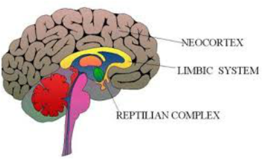
It's also important to understand that, as I told you before, sight is connected directly to our reptilian complex BUT, letters and words are processed as if they were audio files, this entails to a slower processing of information and rationalizing data because the auditory nerve is not connected to the reptilian complex.
That's a brief explanation of the importance of color in our everyday life. Definitively, color is the strongest and most persuasive way to stimulate our sight.
Research had proven that consumers care more about color in products than characteristics such as smell and texture.
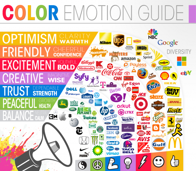
Let's see what our brain thinks when we see different colors:
• Grey: Means absence of commitment or doubt. But it can also be interpreted as serenity, maturity or balance.
• Blue: Is the color of the sea and the sky, that's why our brain gives the message of serenity, tranquility and peace. It has a curious effect on people's appetite, blue suppresses appetite because there are no blue products (food specifically) in nature. This is the color for good health so we can see hospital o health products publicity and infrastructure using shades of blue but it's definitively a bad idea for food products or restaurants advertising, unless you're selling "light" food.
• Green: Symbolizes life, nature, fertility, and perseverance however our brain may also think in change resistance with this color, so BE CAREFUL! Green has also been related to money and richness. It is a perfect color for medications, tourism or green products; awesome in bank or financial organizations publicity.
• Red: Interpreted as action, passion, sensuality, blood, desire for success, adventure, willpower and danger. This color is frequently used in dangerous zones but also, used for cars, sports and energy drinks brands. Men are the most frequent target of brands and publicity using this color.
• White: Is light, innocence, the color of perfection, cleanliness, purity. HOWEVER, be careful with different cultures because in Japan white means death. It is very common to see white for charity events or religious organizations, but is also very used for technology brands.
• Yellow: It's the color of sunlight and it makes you feel happy, intelligent and good energy. This color is related to pleasant scents. It has been used for kids products not for men. And you may want to apply yellow for highlighting important stuff in websites but it's not recommended for written publicity.
• Orange: It is a stimulating color, it gives the sensation of coziness and warm places. It also symbolizes attraction, creativity and success. This color is a very good idea in gym's walls or in a creativity department office.
• Purple: Means nobility, luxury, ambition, sofistication wisdom, independence and dignity. Is a perfect color for women's products publicity such as perfume, clothing and shoes. But you may also see purple in children’s products or sweet treats, specially chocolates.
• Black: Interpreted as tragedy, mourning or fear, also related to mystery and evil. But it can also mean elegance and prestige, that's why it has been used for cars and motorcycles branding, and you may also have seen black in jewelry stores and brands, watches and designer clothing advertising.
First, I will tell you what is color. It's a component of light which is separated when it’s reflected off of an object.
It's also important to understand that, as I told you before, sight is connected directly to our reptilian complex BUT, letters and words are processed as if they were audio files, this entails to a slower processing of information and rationalizing data because the auditory nerve is not connected to the reptilian complex.
That's a brief explanation of the importance of color in our everyday life. Definitively, color is the strongest and most persuasive way to stimulate our sight.
Research had proven that consumers care more about color in products than characteristics such as smell and texture.
Let's see what our brain thinks when we see different colors:
• Grey: Means absence of commitment or doubt. But it can also be interpreted as serenity, maturity or balance.
• Blue: Is the color of the sea and the sky, that's why our brain gives the message of serenity, tranquility and peace. It has a curious effect on people's appetite, blue suppresses appetite because there are no blue products (food specifically) in nature. This is the color for good health so we can see hospital o health products publicity and infrastructure using shades of blue but it's definitively a bad idea for food products or restaurants advertising, unless you're selling "light" food.
• Green: Symbolizes life, nature, fertility, and perseverance however our brain may also think in change resistance with this color, so BE CAREFUL! Green has also been related to money and richness. It is a perfect color for medications, tourism or green products; awesome in bank or financial organizations publicity.
• Red: Interpreted as action, passion, sensuality, blood, desire for success, adventure, willpower and danger. This color is frequently used in dangerous zones but also, used for cars, sports and energy drinks brands. Men are the most frequent target of brands and publicity using this color.
• White: Is light, innocence, the color of perfection, cleanliness, purity. HOWEVER, be careful with different cultures because in Japan white means death. It is very common to see white for charity events or religious organizations, but is also very used for technology brands.
• Yellow: It's the color of sunlight and it makes you feel happy, intelligent and good energy. This color is related to pleasant scents. It has been used for kids products not for men. And you may want to apply yellow for highlighting important stuff in websites but it's not recommended for written publicity.
• Orange: It is a stimulating color, it gives the sensation of coziness and warm places. It also symbolizes attraction, creativity and success. This color is a very good idea in gym's walls or in a creativity department office.
• Purple: Means nobility, luxury, ambition, sofistication wisdom, independence and dignity. Is a perfect color for women's products publicity such as perfume, clothing and shoes. But you may also see purple in children’s products or sweet treats, specially chocolates.
• Black: Interpreted as tragedy, mourning or fear, also related to mystery and evil. But it can also mean elegance and prestige, that's why it has been used for cars and motorcycles branding, and you may also have seen black in jewelry stores and brands, watches and designer clothing advertising.
 RSS Feed
